Light and Color
The three dimensions of Color-space
In the 1660s, Isaac Newton began a series of experiments with sunlight and prisms. With these experiments he
demonstrated that clear white sunlight was composed of all colors of a rainbow: the visual spectrum of light.
He laid the path for others to experiment with color in a scientific manner.
Gradually scientists agreed that colour is most conveniently described with three dimensions: the colour itself (hue),
the saturation (for paint: the purity of the pigments) and the brightness (lightness, luminance, or energy of light). A
value scale can be assigned to each of these dimensions. When the three axes are combined in a figure, a spatial
three-dimensional figure (length, width and height) is created, hence the name colour space.
Over the centuries, dozens of mathematical forms of 3-D colour spaces have been presented: sphere, pyramid, cube,
cylinder, cone, etc.... Below are a few examples:

The three primary colours of the eye
In the 20th century, colour theory has advanced to such an extent that it can be successfully and with mathematical precision applied for the representation of colours in printing, photography, on a screen. The CIE Lab is an example.
After the discovery of tricolour printing in the 17th century, people wondered how it is possible that the eye can see all colours while only three colours are printed.
Young (1801) suggested that our retina cannot respond to an infinite number of colours, but only to three colours, which are therefore called primary colours. The scientific evidence for this was not provided until 1983 by Dartnall, Bowmaker, and Mollon.
The eye has three types of cones that are each sensitive to a part of the light-spectrum: to red, green and blue (not red, yellow and blue) and a kind of rods that are especially sensitive to low light intensity. The eye is very sensitive to differences in brightness, much less to small colour differences. Since 1801, a lot of scientific research has been done on light in relation to our vision and colour.
Below is a summary of contemporary insights with an emphasis on colour and its use in painting.
.

Colour Vision
Of the daylight, only a limited part of the radiation, the light spectrum, is visible to the human eye. The spectrum of daylight consists of all the colours of the rainbow. The human eye can distinguish all those colours because it has three types of light-sensitive cells (cones) that are each sensitive to light with a different colour (= wavelength): Red (L: longwave), Green (M: mediumwave) and Blue (S: shortwave). Each type of cone is sensitive to part of the light spectrum, the blue cones are maximally sensitive to blue, but also a little to green, the green ones are extra sensitive to green, but also a little to blue and red, the red ones mainly to red, but also to green and even slightly to blue.
The colour Green.
The light sensitivity curves of the three types of cones overlap. The blue and especially the red cones are also sensitive to green light. The eye is therefore most sensitive to green light as shown by the total colour sensitivity of the eye. Because the eye can only handle a limited amount of light, it seems that when the eyes see a green colour, the cones are already partly saturated, as if there is less room left for the other colours.
This also explains why painters and carpet weavers have always experienced that green seems to blur other colours in the painting, unless the right complementary colour is put next to it.
Cézanne and Monet obtained brilliant results by using the right counter-colours.
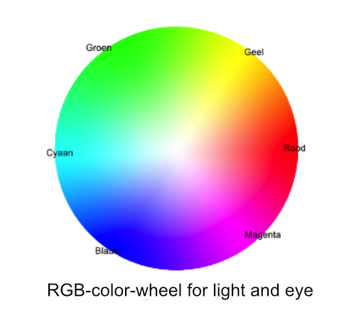
The RGB colour-wheel for light and eye
Red, Green and Blue (RGB) are called the primary colours of light. The secondary colours cyan, yellow and magenta are
obtained by mixing two primary colours of light: red and green gives yellow, red and blue becomes magenta, and
blue and green gives cyan.
Christiaan Huygens (1629 -1695), a contemporary of Newton, experimentally showed that light of certain colours can
be obtained with only two or three different light colours. The same colour can be obtained with countless different
combinations of coloured light. By mixing two or three primary-coloured lights in varying proportions one can get all
visible colours.
When the light becomes less bright (the lamp or the sunlight less strong) the colours shine less bright, darker.
Colours directly opposite on the edge of the colours wheel are called complementary. All the
opposite colours on the circle edge (which form the ends of an imaginary straight line through the centre)
are complementary. When two complementary colours ae mixed one gets white light, e.g., the complementary-pairs:
Blue + yellow, Green + magenta, Red + cyan. There are endless combinations of complementary light pairs that
together produce a white light.
An object is coloured because only part of the light that falls on it will be reflected; the rest is absorbed.
Thus, a red-coloured object absorbs all the colours of daylight, except for the reflected red part of the spectrum.
With the absorption of parts of the spectrum, the corresponding light energy is also absorbed. Reflected colours
are therefore less bright than the light that falls in it, has less energy.
Complementary and successive contrast
Complementary or simultaneous contrast.
Eugène Chevreul found in 1839 that the colours of certain colour-pairs appear more intense when they are stiffly put
together than when they are not against each other and are seen separately. With other colour pairs, it seems that
adjacent colours reduce each other’s brightness. When the surfaces are taken apart, they regain their normal
brightness.
Chevreul defined the complement as the part of the spectrum that is missing in the light: e.g., In a red light only the
red part of the spectrum is present.
When only cones which are sensitive to red are stimulated, the other cones apparently also want to do something so
they simultaneously suggest the missing (complementary) colours. These simultaneously created colours are not
really present, but exist only in our eye. Apparently, it is pleasant for the eye when the colour-structure is balanced,
when the three different colours cones are stimulated with more or less the same measure of light. When that is not
the case, the eye tends to complement the missing colours, as it were.
So, a red surface, which absorbs green (and blue), tends to make all adjacent surfaces appear greener. Green therefore
appears greener by putting red next to it, while conversely the red appears redder due to the adjacent green.
The complementary contrasts red-cyan, blue-yellow and green-magenta are the most prominent.
Successive (sequential) contrast effect (after-image))
When one stares at a bleu dot for a while and then looks at a plane white surface, one sees the successive
(sequential) contrast or negative after-image - the vague supplementary colours (complements) of the original
colours - with the same form of that dot on the white background. Chevreul named that complementary colours
or counter colours (18)39. The explanation is that the cones in the eyes that register blue become "tired" of looking
at a blue dot for a long time, which suppresses the colour-sensitivity for bleu a little. When one then looks at a
white screen with tired cones, the eye sees a white from which a little blue has been extracted, as a result a brief
afterimage of a vague dot arises in the complementary colour yellow.
The effect also distorts your perception of adjacent colours. Looking at a bright spot of orange-red with a yellow
spot right next to it. The negative afterimage of orange-red is green-blue, the yellow spot is therefore perceived
as a duller than it really is. You "see" a less saturated yellow due to the overlap of the blue-green afterimage.
The biological properties of the eye
This simultaneous and successive contrast effect occurs in all colour-pairs where one pair is experienced as lively and brilliant and the other as less bright or dull. These visual properties are biologically determined. In contrast with the symbolic meaning that some colours have in a certain culture, e.g., white in the East is often used for mourning while in the west it’s a sign of purity.
Coloured Images
Colour mixing: Additive, subtractive, optical (partitional or mixed)
In an additive colour system (addition of light energies), when coloured light is mixed, white light is created with two complementary colours with the same brightness. Additive because the colour is created by merging coloured light causing the composite colour to be brighter than any of the composite colours. Examples: the colour dots of the TV’s and computer-screens, stage lighting.

On this greatly enlarged view, four different subtractive shaped colour dots: Cyan (1), Magenta (2), Yellow (3) and
Black (4) are printed on top of each other creating the multi-coloured pattern of (5).
At full size or seen from afar, the light of the dots mixes additively into an even colour (6).
With whiter between the dots, the colour becomes brighter (more reflected light), with more black dots, the
colours are darker.
Subtractive (subtraction of light energies). From a coloured object, part of the (day) light that falls on it is absorbed by
one or more dyes, the rest is reflected. The reflected light is therefore missing colours and the object is therefore
coloured. This is true for all material and visible things around us.
Optical- (Partitional-) colour mixing happens when different coloured dots are placed next to each other and with
rapidly successive colour changes. It is an intermediate form: The reflected light from subtractive colour dots or
surfaces (e.g., on a painting or in printed matter) are optically mixed in the eye. As a result, optical mixing colours
are less bright than those of additive mixing (pure light), but brighter than those of the subtractive colours that are
reflected by large even coloured areas (wall, painting, etc.).
On a colour-print or a pointillist painting the reflected colours of the (small) dots fall as light on the retina. Because the
dots are so small and close together, they mix additively (light) in the eye. Paintings, just like modern printed matter,
can be made with a combination of subtractive and optical use of colour. This happened especially in Pointillism
(stipple technique) and Impressionism in the second half of the 19th century, shortly after the theoretical knowledge
of modern colour theory became available.
Cézanne consistently applied this principle in his mature work
Colour systems for eye and palette. .
In practice, different colour circles are used when working with colour. The additive and subtractive colour-wheels have the colours on the outer edge in common, these are the pure colours.
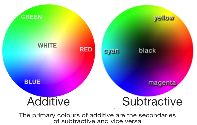
- For daylight, stage lamps and screens (additive) the RGB circle (the primary colours red, green, blue) is used. Towards the centre, the additive colours become lighter and brighter, it’s mixing with light; light energies are added up: the resulting colours are brighter than the individual constituent colours
- For colour printing and the palette (subtractive). On the subtractive circle, the colours towards the centre become darker and less pure because light energy is absorbed by the paint. In printing, the three primary colours cyan, magenta and yellow are used. A mixture of the three primary colours or of a complementary colour pair should theoretically produce black, but in practice a kind of brown is created. That is why black is added separately (colour printing: CMYK). Because light energy is absorbed, no white can be mixed with primary colours. The white of the paper is used or white ink is used.
Everything we see enters our eye as light, so for the eye the additive colour wheel applies. If a painter wants to use optical colour effect because he wants to obtain bright colours, the use of the subtractive circle is useful because that is simply the way paint behaves and is seen on a canvas. In this way he can concentrate on the possibilities that complementary and successive colour effect offers for the production of the painting. The colour schemes of Blanc or Itten, still often used by painters, are based on mixing paint and therefore useful when mixing colour on the palette. In both Blanc and Itten Yellow is taken as the primary colour instead of green (additive colour-wheel).
Colour theory after Chevreul
Schedule of Blanc
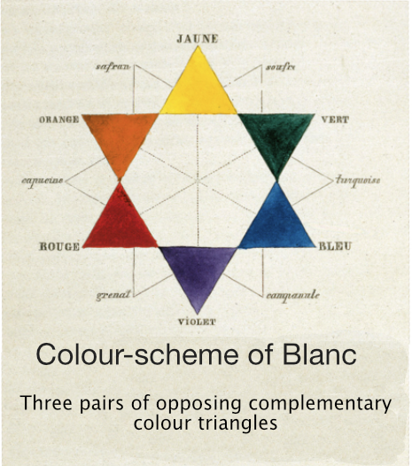
Charles Blanc further developed Chevreul's theory and published his book "Grammaire des Arts du Dessin" in
1867. He explains his theory using a colour scheme consisting of six triangles, the primary colours red, yellow
and blue and the secondary or mixed colours orange, green and violet. This scheme, like Chevreul's, was based
on mixing paint and not on mixing light. Because the green has not been chosen as the primary colour, deviations
arise from the modern colour circles. His colour scheme therefore does not meet the visual effect of the eye.
Despite the small differences, Blanc’s scheme was a point of departure for the development of modern colour
theory, which is established on light- and eye-experiments.
Blanc explains how colours can be mixed using his scheme and states that colours reach their maximum
intensity when they are combined with their complements. But he also warns that they can either triumphantly
support each other, or destroy them completely.
He advises painters, among other things: to use colours as much as possible optically instead of traditional mixing
them on the palette. That inspired many painters of the time to do experiments with colour. The Impressionists,
Pointillists, Cézanne, Monet, van Gogh and Matisse, among others, investigated how they could make optimal use
of this for the development of clear painting.
Schedule of Johannes Itten
In the 20th century, Blanc's colour theory was further developed by Johannes Itten (Bauhaus). He published a
colour circle based on subtractive colour mixing (paint) and which is still used by many painters when mixing on
he palette.
He also uses yellow as the primary colour instead of green.
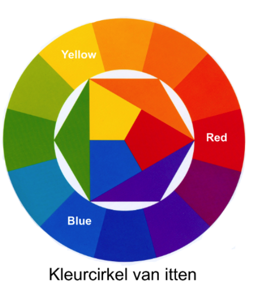
Itten distinguishes seven contrasting colour-pairs:
First of all, the three colour-pairs that correspond to the three dimensions of the colour space for light:
- 1. The colour itself or hue depending on the frequency of light (all colours along the edge of the colour circle),
- 2. Saturation or purity (with paint: the percentage of pure pigments or mixing with other colours)
- 3. The brightness (lightness or luminance), a measure of the energy of the light that falls into the eye
Then two pairs that are the result of the functioning of the eye. Chevreul defined it as a phenomenon:
"the complementary or simultaneous contrast".
Itten distinguishes two separate contrast pairs:
- 4. The complementary contrast. Some side-by-side colour pairs seem to reinforce each other, others seem to weaken each other.
- 5. The simultaneous contrast. The phenomenon that a random colour virtually evokes the complementary colour, so grey within orange apparently takes on a blue tint..
Finally, two contrast pairs based on the human experience:
- 6. The quantity contrast: many of one or two colours versus little of another colour.
- 7. The hot-cold contrast: for example, red (warm) against blue (cold).
In addition, he discusses two, three, four and six sounds in colour, how great masters from the past applied colours and what they could express with them.
Painters after Chevreul and Blanc
The colour theory of Chevreul and Blanc was embraced by many painters from the second half of the 19th century on, they started experimenting extensively. Nevertheless, its use is still complicated because many more aspects (contrasts) have to be taken into account than just putting the right colour pairs next to each other.
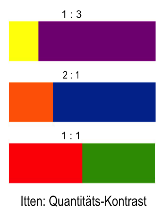
Colours have a different degree of brightness (energy) as Itten already knew (quantity contrast) and Gerritsen
scientifically demonstrated. Itten even gives the proportions of the size of surfaces with different colours for
obtaining a visually equivalent impression. These are slightly different proportions of relative brightness according
to Gerritsen's theory.
The bottom line is that in many cases one has to take into account multiple colours and colour contrast pairs at
the same time e.g., in the way Itten defines them, plus the effects not mentioned by him such as: - The phenomenon
that some colours seem to emerge, others seem to give way, or - the subjective values of colours, or – the cultural
meaning of certain colours.
The painters were therefore dependent on the experience of their eyes. They always have been, but in the second
half of the19th century all kinds of interesting possibilities opened up, which they explored experimentally while
painting and with the principles of the new colour theory in mind. For example, they discovered that certain colour
relationships suddenly seem to interact with each other at a certain moment, as if the entire canvas suddenly
comes to life, or not.
.